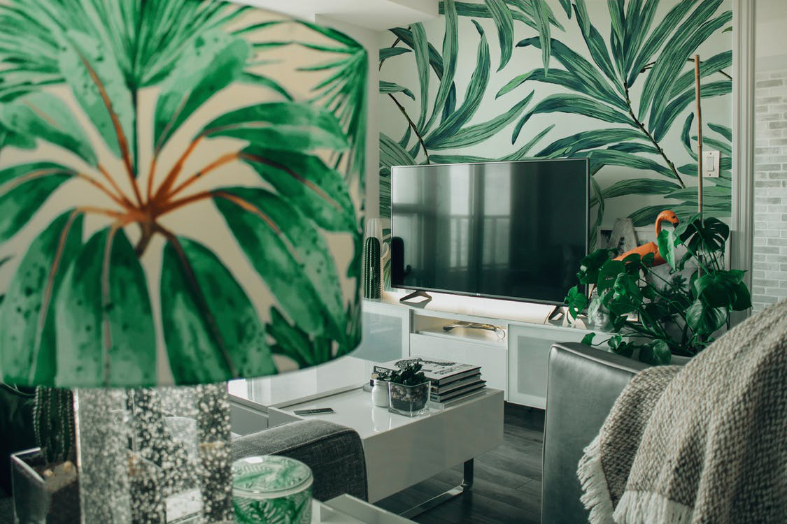
Building a mood board is a design freak’s greatest pass time and for good reason. It’s not only your greatest asset to building an image of how you want your dream interior décor to look like but it’s a general reflection of your mood.
Whatever inspires you, strikes your fancy, and allows you to tap into your maximum creative potential is compiled onto a mood board
What is a mood board?
If your Pinterest is overflowing with multiple design ideas, you’re probably no stranger to the concept of a mood board. It is essentially a unified platform, much like a collage, used to translate a particular theme or mood or feeling. It’s the first step to making sure transient and abstract ideas are translated into tangible visuals and are a necessary
precursor to any design project.
What goes into a mood board?
Since the main idea is to express a certain vibe with a
mood board, they don’t have to be restricted to just images or text. You can use it as an inclusive space and add as many quotes, textures, photographs, shapes and designs.
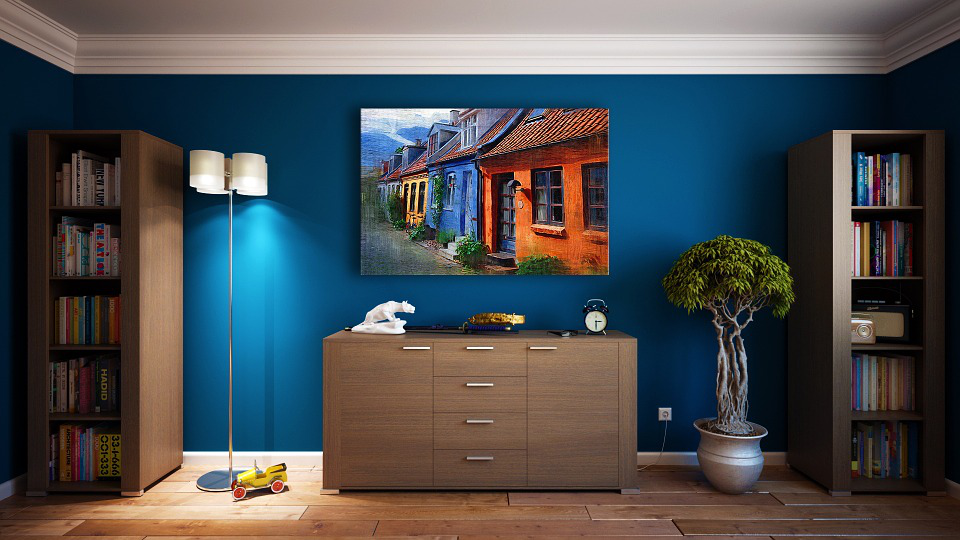
One of the most important things in a mood board that acts as a cohesive agent is colors. Colors are a mood on their own and can really set the tone of a space you are trying to design. They can help determine how calming a room can feel. It can also be important to remind yourself what you are hoping to achieve by redesigning a space in the first place and can help make decisions accordingly.
Must have colors in your mood board
Mood boards are a personalized and individual exercise but the following are some of the most
popular trends for mood boards in the summer.
Yellow
Associating a sunny yellow to summer is hardly a new concept, but this summer earthier tones of yellow are popular. Shades like turmeric and mustard add rustic touches to a room and spark positivity in spaces that need a massive cleanse!
Champagne
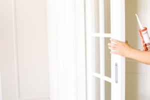
Think elegant, poised and neat. This color is surfacing its way as a more elevated supplement to otherwise neutral and boring beige. If you’re thinking of redesigning the panels and doors for homes or office spaces, this demure shade on wood finishing will instantly add class to a space and make the furniture stand out.
Sky blue
This is a popular color in places that need more calmness and less chaos. So if you want a room to be toned down and reflect more light then, this color is going be the ultimate cool accent that can help you achieve that.
Ikonni is one of the only U.S brands to provide tailored solutions to professionals to achieve their design goals. Browse through our
catalogs for more of our custom design solutions.
Contact us for more information.